Color Stories 2026: The Shades Defining the Year
- Mar 12
- 5 min read

Color in 2026 is no longer used as an accent. It is immersive. Atmospheric. Emotional.
For years, color in modern interiors functioned cautiously — applied to cushions, artwork or a single feature wall. The architecture itself remained neutral. White ceilings. Pale floors. Safe beige backdrops. Color was decoration, not foundation.
That hierarchy has shifted.
Interior color trends in 2026 reveal a deeper cultural recalibration. Homes are no longer designed primarily for visual lightness or resale value; they are designed for psychological presence. Color is being used to shape experience from morning to evening. It wraps around architectural elements rather than sitting on top of them. It defines mood rather than merely punctuating space.
Across European interiors especially, we see tonal application — walls, trims and ceilings painted in close variations of the same hue. Wood tones echo the warmth of painted surfaces. Textiles reinforce the palette instead of contrasting it. The result is immersion.
Trending interior colors in 2026 are not about boldness. They are about resonance.
Five shades, in particular, are defining the year — not because they are loud, but because they hold emotional weight.


Dusty Plum: The Most Unexpected Interior Color Trend of 2026
Dusty plum is perhaps the most unexpected shade among the interior color trends of 2026. It sits somewhere between lavender and grey, softened by brown undertones that remove any sense of sweetness. Where cool greys once dominated Scandinavian and modern interiors, dusty plum introduces depth without overt femininity or drama.
Its power lies in its restraint.
When used tonally — on walls, trims and occasionally ceilings — dusty plum creates an enveloping softness that feels architectural rather than decorative. It eliminates stark contrast and instead allows furniture silhouettes to emerge gently from the background. Paired with walnut, smoked oak or chocolate brown, it gains sophistication. Paired with brushed brass or aged metal, it gains quiet richness.
What makes dusty plum particularly relevant in 2026 is its emotional ambiguity. It feels nostalgic without being retro. Contemporary without being stark. It reflects light differently throughout the day — appearing almost grey in morning light and deeper, moodier at dusk.
In urban apartments especially, dusty plum introduces character without overwhelming small spaces. It replaces the cool neutrality of the 2010s with something more layered and human.

Warm Sand: The New Neutral in Modern Interiors
Warm sand marks a subtle but important evolution of beige. For years, beige carried a reputation of safety — pleasant but uninspired. In 2026, warm sand reclaims neutrality with depth.
Unlike cool-toned beige, warm sand carries golden and slightly peach undertones. It reflects natural light softly, creating an atmosphere that feels luminous rather than flat. When applied tonally — walls, trims, even cabinetry — it removes harsh edges and creates cohesion across architectural surfaces.
Warm sand is particularly effective in smaller homes where contrast can fragment space. By maintaining a consistent palette, the room feels unified and expansive without relying on stark white.
It also acts as a bridge between contemporary and traditional elements. Vintage wooden furniture appears richer against it. Linen textiles glow. Even sculptural modern pieces feel grounded rather than floating.
Within modern Scandinavian interiors, warm sand is increasingly replacing bright white as the base tone. It maintains clarity, but introduces comfort. It is minimalism matured.
In the broader conversation around interior color trends 2026, warm sand represents emotional neutrality — calm without coldness.

Muted Olive: A Grounded Direction in Interior Color Trends 2026
Muted olive is one of the most psychologically grounding shades of the year. It connects interior space to landscape, but in a refined way that avoids rustic clichés.
Unlike vibrant green tones, muted olive carries grey undertones that soften its presence. It feels stable. Mature. Architectural.
In 2026 interiors, olive is rarely used in isolation. Instead, it is layered with complementary earth tones — caramel textiles, walnut furniture, chocolate accents. The palette feels cohesive and organic rather than decorative.
Muted olive performs particularly well in living rooms and dining spaces. It absorbs light gently, reducing glare and creating a sense of enclosure. When paired with warm ambient lighting, it transitions beautifully from daytime softness to evening intimacy.
The rise of muted olive reflects a broader movement toward biophilic influence in interiors — but in a subtle form. Rather than introducing plants as statement features, designers are integrating nature through color and material.
Within trending interior colors 2026, olive signals confidence. It does not demand attention; it commands presence quietly.
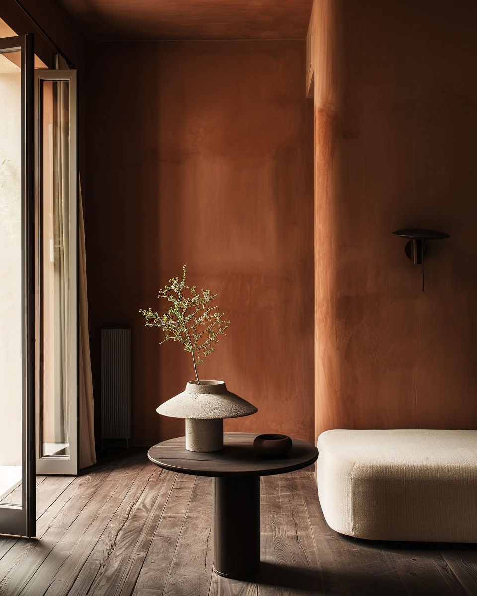
Burnt Terracotta: The Return of Earth-Based Tones
Burnt terracotta carries cultural memory. It references Mediterranean architecture, aged clay surfaces and sun-warmed facades — yet in 2026 it appears in distinctly modern interiors.
What differentiates burnt terracotta from brighter orange tones is its muted, mineral quality. It feels grounded and slightly smoky rather than vibrant. This makes it adaptable.
Used in tonal applications — walls and trims in close clay variations — it creates intimacy. Used as a singular enveloping shade in a dining room or study, it adds warmth and drama without theatrical excess.
Burnt terracotta pairs exceptionally well with chocolate brown and dark woods. Together, they create a palette that feels rooted and substantial. The combination moves interiors away from the airy, pale aesthetic that defined the previous decade and toward something more anchored.
This shift toward clay-based hues also reflects a broader appreciation for craftsmanship and material authenticity. Plaster finishes, limewash walls and textured surfaces enhance the mineral depth of terracotta tones.
Within interior color trends 2026, burnt terracotta introduces heat — but controlled heat.
Chocolate Brown: The Boldest Shade in Trending Interior Colors 2026
Chocolate brown may be the most defining shade of 2026. After years dominated by lightness, the return of deep brown marks a dramatic recalibration.
It is bold, yet comforting. Dramatic, yet deeply grounding.
When applied to walls and ceilings, chocolate brown creates immersive spaces designed for evening presence. It performs particularly well in studies, libraries and dining areas — rooms intended for depth rather than brightness.
Unlike black or charcoal, chocolate brown retains warmth. It softens shadow rather than intensifying it. When paired with layered textiles and warm table lamps, it produces a cinematic atmosphere that feels intimate rather than heavy.
The re-emergence of brown signals a rejection of sterile modernism. It acknowledges that darkness can be luxurious when balanced correctly.
In modern Scandinavian interiors especially, chocolate brown is often combined with muted olive or dusty plum for tonal complexity. The effect is layered and adult.
Among trending interior colors 2026, chocolate brown is perhaps the clearest signal that minimalism has evolved.

The Emotional Thread Behind Interior Color Trends 2026
What unites these five shades is not trend momentum — it is emotional intent.
Interior color trends in 2026 are not about standing out in photographs. They are about shaping lived experience. They reflect a collective shift toward interiors that feel enveloping, grounded and psychologically resonant.
Color is increasingly understood as architectural rather than decorative. It shapes proportion. It influences light behaviour. It defines how space is perceived at different times of day.
For decorators and design professionals, this shift demands fluency beyond aesthetics. Understanding trending interior colors 2026 is not simply about selecting the right shade — it is about interpreting context. How does dusty plum behave in northern light? How does olive interact with dark wood flooring? How does chocolate brown alter ceiling height perception?
These nuances separate styling from design literacy.
At Nordic Design Institute, we approach color as composition — layered, contextual and deeply intentional. Because trends evolve. But the ability to read them — and translate them into cohesive interiors — defines the modern Interior Decorator.
In 2026, color is not an accent. It is atmosphere.
FAQ: Interior Color Trends 2026
What are the trending interior colors for 2026?Dusty plum, warm sand, muted olive, burnt terracotta and chocolate brown.
Is white still popular in interiors 2026?Yes, but it is increasingly replaced by tonal, earthy hues that create warmth and immersion.
How are interior color trends changing in 2026?Color is being used tonally and atmospherically rather than as contrast or accent.


Comments